About The Project
Dirty Magic started as an illustrated novella project back in 2019. As of 2025, it has shifted into being translated into a graphic novel trilogy. The original novella (without artwork) can be read for free here.
Since this will be released over an extended period of time, it has become a massive priority to make sure that we had the visual language and direction of the graphic novel project defined before proceeding forward towards producing pages.
All character designs, concept work and illustrations were completed in 2019 unless stated otherwise. All work can be clicked on to be viewed at a higher resolution.
Character Designs: The Main Characters
The Heroes Protagonists of Our Story
But first! The Story!
Dirty Magic is a story about what happens when its not enough to be Good or Evil when both sides are beginning to blur the lines, and the players on either side are beginning to realize that they’re nothing but pawns to the games of either side’s Ego. To say that it’s a not-so-thinly veiled introspective allegory around Beliefs, Shame and the ways in which we villainize others as a means to find a deeper sense of self-acceptance is an understatement.
A lot of the inspiration comes from growing up in a Catholic household and unpacking the psychology around being raised in that environment but also in a world that mirrors much of those same ideologies as a way to maintain systems of abuse and power.
We could play it coy but then everything around our creative decisions would lose their meaning.
And with that, we’ll return to a look at the process behind this project’s visual development.
The main characters of the story focuses around beings who are supposed to be Angelic and Demonic in origin without them knowing who work in a modern human world as Wish Contractors (Angels) and Genies (Demons). This brought on the challenge of finding subtle ways too convey their roots to the viewer without it being so overt that the characters themselves may be aware of who and what they were before they came to be the characters that we know them to be in the story.
Part of that challenge was finding new and refreshing ways to communicate their Heavenly and Diabolic qualities without making them extremely heavy handed and obvious to the viewer since we are striving to create for a more mature audience that we can trust to pick up on nuance. It was also necessary to lock in whatever visual cues we’d be relying on so that we can apply them to other characters in the cast that fall into various alignments as is needed.
Mia
The “Angel”
I decided on a few qualities to denote angelic alignment: Hair that focus on round, cloud like shapes with skin and hair colors that sit on the cooler end of the color spectrum.
The Coolness in coloring and the Rounder shapes was to help communicate the idea of Levity in the characters – i.e. Heavenly/Higher/Holy Alignment – without necessarily locking our characters into automatically being perceived as Good as part of the story’s focus is on deconstructing the idea of Good vs. Evil.


Savannah
The “Devil”
To provide contrast, I went with focusing on hair shapes that replicate the flow of Lava as well as warmer skin and hair tones for our Diabolically inclined characters. Similarly, I went with warmer skin tones and more Flowy/Lava like hair for our diabolic characters. This gave us the room to help them read as being more intense and chaotic visually without actively relying on reinforcing it continually in writing.

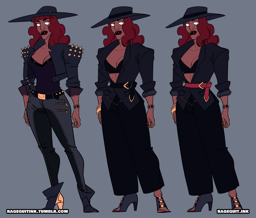
I also decided to push the projection of a need for chaos with Savannah as she is significantly more outwardly and actively destructive than others in her alignment for reasons that would later be explored in the story.
Character Designs: Secondary Characters
Additional Players in The Story
There are three major players in the first book that we also needed to design: One additional Diabolical character and two humans. The fact that humans who weren’t in either alignment made it even more important to develop a visual language that made it clear for viewers to be able to more quickly discern who is Good, Who is Evil and who is… well. Human.
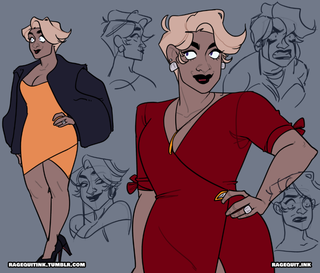
Lindsay and Boss
In the first book – DIVINE MALCONTENT – there are two humans who play pivotal roles to the story: Lindsay, Mia’s ex-fiancée with whom she had a very nasty falling out with and Boss, Mia and Savannah’s manager at their job who has no real knowledge of anything that’s actually happening in terms of who her actual employees are in reality. For these two, I messed with the color palettes and tried to use a mixture of warm and cool tones to better showcase how humans are by nature complex and are not by design falling in alignment with either side.

Crystal

As a Demon who found a loophole to escape working in service to anyone but herself, Crystal presented a new challenge: How can I show who she is to the viewer without it making overtly obvious to the world around her. For this, I decided to look back at Savannah’s design and embrace a few things that are both present yet not as intensely highlighted: how pointy her features and her ears in a way that would make it more easy to read her as evil.
This allowed me to develop Crystal in a way that shows off in sharp contrast to Savannah. I embraced the sharp angles for her face but did something that was counter to how Savannah presents (and is a poignant marker for her as a Genie) which is to allow Crystal’s pointed ears to be on full display. Even though Crystal is on the run in the story, she was designed to clearly be significantly more proud of her ability to be a Demon out in the open to contrast the shame that Savannah and the other working Genies unconsciously were feeling.
This was part of why it felt important to lean into a more “clean” look for her silhouette to showcase how much more self-possessed and self-composed she was on first meeting.
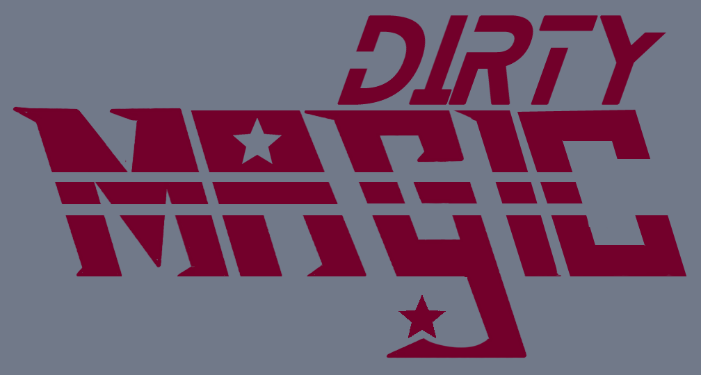
Dirty Magic: The Logo
A Nod to 80’s Anime and Modern Fantasy
Another challenge for the project was designing the logo. It was important to design something that was bold and stood out on it’s own but we also wanted to do a slight nod to 80s anime – specifically the anime Dirty Pair (name unrelated). This was to both embrace the chaotic nature of the relationship dynamic between the two main characters while focusing on carving out a logo that seemed relevant within a modern fantasy related space.
Inspiration for IDeation

The biggest thing that was appealing about these logos was how clear and bold they read to help them stand apart from usual fantasy logos. Another thing that stuck out about the logo was how futuristic the logo itself reads. While Dirty Magic isn’t technically a sci-fi story, it still operates in a world that’s tangential to the world we see as modern which makes it feel futuristic in contrast to the more biblical mythological roots in it’s storytelling.
The turn towards older anime was also due to the fact that stylistically and tonally, the stories that we are developing were meant to feel like a reflection of the kinds of anime and manga we grew up watching and reading. Though I never quite got sucked into Dirty Pair personally, there was always something exciting about the stylistic direction of the series as a whole, including the dynamic between the two main characters that mirror the dynamic between Mia and Savannah to a certain degree.
Ideation to Final
The initial inclination was to lean into how futuristic and blocky the original inspirational logos were. However, as I started exploring that avenue, it started giving the logo a more Militaristic feel rather than the futuristic fantasy direction that we were aiming to go in for the story.
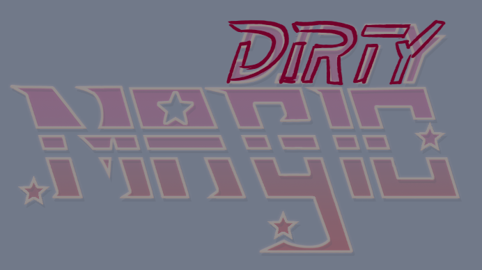
After a few passes, the one thing I decided was worth keeping was the shooting star element, however everything else about the logo left me wanting. Even if the story itself had a slightly futuristic feel, the story was still heavily rooted in fantasy in every aspect and that was missing from the original drafts of the logo. I decided the best decision from there would be to lean into the magical element to better reflect the genre of the story.


This shift ended up adding a lot more play and movement to the logo which also spoke more true to the style of storytelling that was a bit more sarcastic and dry in tone. I was able to find a happy medium between creating flow, while making the logo bold enough that it reads as a rather intense story without it worrying about it feeling overbearing.

The Journey Towards Promoting
Telling the Story Without Giving It Way
Even though the story wasn’t going to be released for a while, I was still focused on getting a general idea of how I’d like the promotional artwork to look by the time we eventually get to releasing anything. This was also a chance for me to get a better understanding of the characters themselves as well as the inevitable dynamic that the both of them would develop as the story progressed.
My major goals were to make sure that everything was:
- Bold
- Dynamic
- Somewhat Unsettling
The last felt especially important due to the direction that the story would be moving towards since it is a story around the two main characters triggering Armageddon while also exploring their own sense of rejection and how they relate to things such as being corrupted and feeling inherently unworthy by design.
ROund 1
The first illustration that was completed proved to be challenging. On top of just trying to capture their dynamic the way I was hoping for, I also had the added challenge of trying to figure out how the magic that they use would read visually. For this, it was decided that it’d be better to go Too Far rather than Too Timid since these characters, at the end of the day, are extremely powerful and it’d be easier to edit back than figure out how to add moving forward.
The other thing I was hoping to capture in this is the sense of Sickness around them. It helped that the story takes place in what would be a version of Los Angeles county, and with the active pollution that happens in that area, it has a tendency to add a distinctly unnatural yet vibrant sense of lighting that I was also relying on when deciding on the color palette for the illustration.
This illustration was originally completed in 2019.

Revisiting the Themes
By the time I started taking the time to start developing further promotional artwork for the story, I had a much firmer understanding of the characters, the story’s direction as well as the overall tone for everything we would be striving for.
These illustrations were completed in 2019 and 2022 respectively.

Tackling these new illustrations also marked a time where I was beginning to settle more into myself creatively in terms of my art style, so this offered me a chance to also get a better understanding of how they’d like look as the project gets completed as well. For example, I decided to lean more into giving Savannah an underbite which became more prevalent throughout all artwork done to give her a predatory look akin to a piranha – especially in profile – to better reflect how dominating her energy would be in the story. Mia on the other hand was given a slightly more squared out jaw to help give her a strong presence to help her read less passively feminine and more in alignment with someone who has a stronger sense of will and determination.
While I felt overall satisfied with both illustrations completed, I still felt dissatisfied in how much it seemed to speak more clearly to the story overall. Even though the story has light-hearted elements, there’s still a severity to the ending that I felt was missing as a lot of the artwork seemed to downplay either character as the potential figures of authority that they would be by the end of the story. In fact, the artwork that had been created up until this point seemed to be missing one of the key elements to the story: The world was ending because of them, rather than them being passive observers and participants to the events that were transpiring.
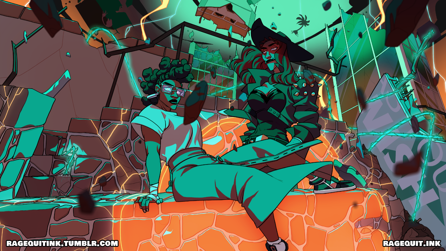
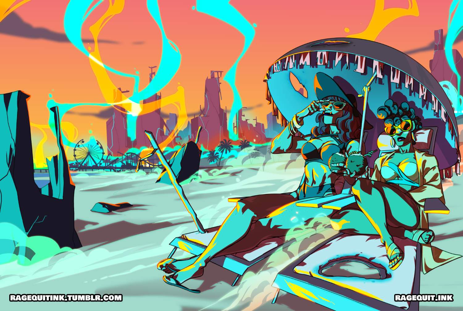
Round 4: Jackpot
The most recent attempt at promotional artwork was exactly what I was hoping to achieve in terms of giving a peak into the story. Since so much of the visual language was about giving the viewer an idea as to who we were dealing with, I wanted to be able to do the same here. I wanted the viewer to be in on the kind of power and authority that Mia and Savannah would end up finding themselves in. I wanted the viewers to have a preview of who they would inevitably become by the end of their tale and after the obstacles that they would go through.
I wanted to make it clear that even with facing the end of the world, the two of them were still somehow unstoppable in their commitment to remaining unflappable in their pursuit for freedom and independence.
This was ultimately less about trying to make them seem cool and more about letting everyone know that this is an inevitability.
It’s hard these days getting into writing – especially with any kind of visual storytelling. Everyone wants to know the ending before they even know the beginning. There’s very little room for actual curiosity and understanding and part of what makes this piece appealing for me as because it does, in a lot of ways, invite the viewer into going through the same lessons that Mia, Savannah and every other character also finds themselves going through: Are you willing to believe what you see even if everything else is telling you to ignore it completely?
Who they are at the beginning is definitely not this but – just like anyone else in life – we rarely end up the same person that we started as and it felt more exciting to treat this as a challenge that would lock me in to their character development to make sure that this is an outcome that I need to commit to delivering.
As a writer, it’s been exhausting over the years watch so many creative projects run to dead ends or just keep running because no one was planning on an ending. So it only seems apropos that the main goal of the illustrations is to show not only an ending within the story but to also serve as a reminder that this story does – in fact – have an ending.
While I will still be doing more artwork for the project in the long run, we’ve both agreed that all artwork done will be done in a similar tonal direction to better set expectations of the story we’re telling.
This illustration was completed in 2023.