About The Project
Catalyst Overdrive (previously named Catalyst) in it’s current and final iteration started initially as a video game portfolio concept before evolving into a full length story for a graphic novel. The work for the project originally began in 2013 with the first episode for the graphic novel currently in development. You can read a WIP of the first 8 pages here.
The main character – Tamara – has been with me since 2007 and started as what most people would consider a comfort character. She existed outside of a clear story for quite some time until 2011 and then again 2013 when I took the time to anchor her into a Sci-Fi story. Everything here is focused on the actual Sci-Fi concept that began in 2013 and the trail that led from being a vaguely interesting idea into the deeply personal story that it is today which – considering Tamara’s beginnings – seems like it was an inevitability.
All character designs, concept work and illustrations go back as far as 2013 and the years completed will be noted. All work can be clicked on to be viewed at a higher resolution.
Character Designs: From Concept to Charisma
The Evolution of an Idea to a Story Worth Telling
These concepts were originally completed back in 2013 as a part of a newly made portfolio to try and enter the video game industry. The drive to go into Sci-Fi was because I had just finished playing the Mass Effect series and experienced something I honestly never considered a possibility: Playing a Black Character in the Future. Something about it stretched my mind in just the right way that I felt like I just needed way, way, way more of it than I was used to seeing.
This led me towards an incredibly vague concept that was still rooted in the original story idea that I had written for Tamara where it was a nod to typical cape graphic novels just in a more slice of life setting. The difference here was that I wanted to actively start moving towards deconstructing it but I didn’t quite know what that meant. The only thing that I knew was that I didn’t want the game concept to center around a group of people that you’d expect to see. I wanted them to toe the line between being relatable and being completely foreign to what you were used to seeing.
I ended up making the original designs for the main cast but it’s clear looking back that these designs were intended to be for a portfolio to showcase hard skills when it came to digital painting and less a focus on actually defining the characters and who they were meant to be – even in the game concept that I was creating.

Another issue that I had as I moved forward with this project is that a lot of the designs for these were definitely a product of their time with a heavy focus on a darker color palette which was popular at the time, especially when it came to sci-fi. The only thing that really differentiated it from that time frame was the focus on creating an actual diverse group of playable characters.
I opted to give Tamara two outfits because in the game, you’d get to play as her both before and after she joined the grew. This is an aspect that remains relevant to the story to this day.
The Jump
The project was revisited around 2016 to be made into an official graphic novel project. I wanted to keep it within the Sci-Fi genre because that need to see someone who I could relate to within the future was still important to me. Because relatability was back at the forefront past superficial means, I started focusing on what it meant to start showcasing the actual personality of the characters. I didn’t want this to feel overly cartoonish even though there was still supposed to be humor because thematically speaking, the story was still incredibly mature in the kinds of themes and conflicts that it would be tackling.


Working on these designs forced me to realize a number of different obstacles that I would have to face with this project:
- How to design futuristic characters without them looking like a product of the time that they were made. So many of the fashion decisions I found myself making over and over again were dependent on fashion trends at the time such as moto jackets and pants, booties, etc. which would continually make the characters feel “stuck” in that era rather than looking towards a new future.
- How to branch out of the usual trend of relying on cool color palettes for futurism that was also a trend at that time when it came to sci-fi imagery. With how personal this story was becoming, I started to quickly lose my taste for cool color palettes because they felt too detached, too distant and too indifferent to everything that was actually happening in the story.
After this round of design attempts, I found myself still feeling dissatisfied which meant I needed to change my focus to better understand what I was trying to get at visually when defining the characters of this story.
Tackling the age old problem of Timelessness
At some point in time, I just got kind of sick of thinking of this as a Sci-Fi story and instead wanted to get back to the actual heart of everything: The fucking characters. Especially with how hyper saturated visual storytelling was becoming, the failings of the previous attempts at character designs made me realize that this was a project that I would end up holding onto, then I needed to realized why I even cared about the story to begin with. This is why I ended up stripping the colors and worrying less about the aesthetics of the world and instead focusing on the personalities of the characters as well as highlighting strong silhouettes and expressions so that it was easy to differentiate each character from each other.
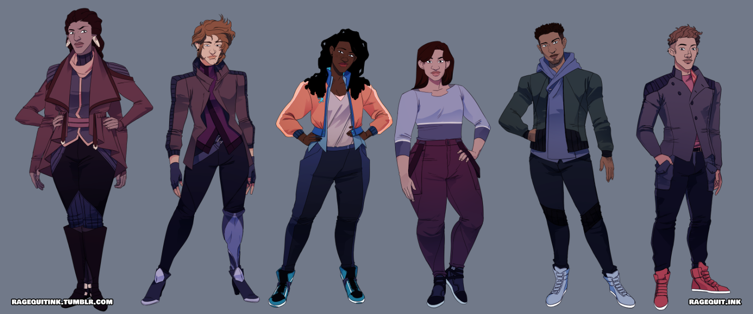
With those things at the forefront of my mind, I ended up diving back into the character designs and the story around 2019 and the end result was exactly what I was hoping for and more:


Similar to when I was working on Bound Blades, the sweet spot for satisfaction seemed to lie squarely in my just focusing on this being a story about people having a poignant experienced in their lives.
With the characters defined, it gave me a bit more freedom to start asking myself the question that I had been trying to answer this entire time: What exactly was my vision of the future? It turns out that the answer was a future that was significantly more Colorful and Dynamic than what I was previously imagining. I wanted to rely more on the vibrancy that I was starting to accept with my other projects that I was developing at the time while finding a new way to bring in a sense of edge to everything that I was depicting.
As much as the steel blue and plum colors were going out of style, it made me realize how much I just genuinely enjoyed working with Blues and Purples, so I opted instead for more jewel tones that gave a strong sense of life but also a passive sense of danger due to their saturation in order to make the project feel stylistically more active, alive and refreshing.

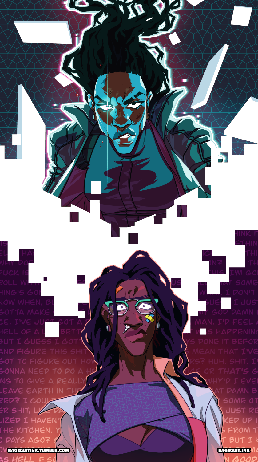
This felt even more important because Tamara as the main character wasn’t really meant to be someone that was openly and actively relatable in the way I was used to seeing. As much as she started as a comfort character, the leap towards actually writing a story made me realize that it can’t always be about me. There was definitely something that I got from working and drawing her when I first started and it was that I wasn’t alone in what I was going through, but in order to actually respect that kind of experience, it meant that I had to take the leap into treating her completely independently of me and what my own emotional needs turned out to be because the only way I’d be able to continue to connect with her as an actual character as I got older was if I was able to treat her as something more synonymous to a friend than just a doll that I was expected to project my feelings onto and play with.
This was part of why I wanted to work with a color palette that made it easier to showcase when her power was Turned On vs Switched Off since power, it’s absence and our relationship to it was becoming a central focus to the story that I was developing.
By the time I was doing sample graphic novel pages and artwork for it, I felt incredibly pleased with the end result which was a story that had the ability to showcase and highlight Tamara’s humanity while also embracing the power struggles that come with existing in a space that seemed obsessed with stripping that away and her need to fight to maintain and reclaim that repeatedly.
Visually speaking, there’s still going to be a lot that I’ll need to tackle and learn how to properly express within the story itself but this is beyond a good foundation for me to start working.
The Logo
From Generic Sci-Fi to Something Alive
A logo for the project didn’t come into the picture until I began the transition of writing it for a graphic novel. The first version of it definitely leaned more into the hard Sci-Fi origins of the earlier game concept and only really served the purposes of making it clear to the kind of genre that this would be, rather than giving a deeper understanding of the overall tone and story that readers would be engaging with.


With how bright and bold the story itself had become, it was clear that the logo would need to go in a similar direction to stand up to it. The story had started to become something that felt a bit larger than life. On one end, it tackled a number of existential worries and concerned that the characters would be facing, on the other end it was shaping up to be a massive Space Opera in a lot of ways, while also being a vibrant and colorful patchwork of strong visuals to bring people into this new world that I was building.
If I had to be totally honest, I just started tossing whatever different elements I could think of that spoke true to the story and what was happening. A Black Hole became a central element since part of the story would denote that everyone’s sense of understanding of themselves, life, the universe and everything within it would be collapsing but also it’s a sci-fi story so a black hole felt relevant. I also started messing with textures as a call to Tamara’s abilities in the story which had the ability to stripe away, manipulate and control the very fabrics of reality.

This felt a lot closer to the overall feel that I wanted for the logo except it still felt a bit too generic. This is when I came up with the idea of trying to implement something that felt like a call to Tag/Graffiti art as a way of showcasing some of the internal struggle that happened with everyone in their story: Their want and need to leave their mark on the world in whatever way that would mean.

This final version was the one that spoke perfectly to the story and would come to be the finalized version of the logo as it is today:
